John Alexis
Guerra Gómez
I build tools and teach developers at the intersection of information visualization, AI-assisted development, and accessibility.
jguerra[~at~]northeastern.edujohnguerra.co
LinkedIn · YouTube · Bluesky · Mastodon
In a nutshell
Information Visualization Researcher and Engineer. I help people extract insights from their data using interactive infovis and data science. PhD in Computer Science, Associate Teaching Professor at Northeastern University Bay Area. Member of the Khoury Visualization Lab. I conduct research on Visual Analytics, Accessibility, Big data, Human Computer Interaction and Web Development.
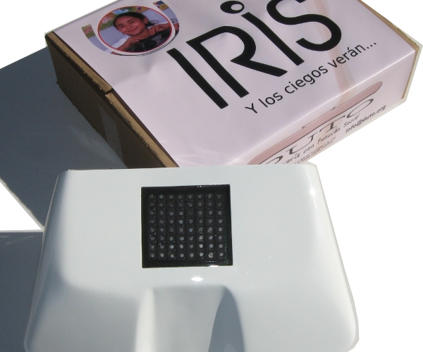
Currently teaching Vibe Coding — AI-Assisted Software Engineering using Claude Code, prompt engineering, and agent architectures. Co-creator of IRIS, a patented system that lets blind children perceive images through touch, and BTactile, a search engine indexing 5000+ tactile graphics worldwide.
Formerly at UC Berkeley, Uniandes Colombia, Yahoo Labs (built internal visualization tools), Xerox PARC (built fraud detection tools), and co-founded DUTO (10+ international awards).
By the numbers
- 23+ years as a full stack engineer
- 21+ years teaching at university level across 4 institutions
- 18+ years researching information visualization
- 30+ publications at CHI, IEEEVIS, AVI, Assets, TRB. Program Committee member of IEEEVIS 2020-24, toCHI 2016, Creativity and Cognition, Graph Drawing. Reviewer for CHI, IEEEVIS, AVI, EuroVis, UIST, and many more.
- Entrepreneur — co-founder of DUTO, KebSolutions, Tweetometro.co and BTactile, with 10+ international entrepreneurship awards
- 21+ years as public speaker — Rice VCS 2025, Legal AI Week, OpenVis 2017, TEDx
Skills
Research:
Information Visualization, Accessibility, HCI, Machine Learning,
D3.js, Vega-Lite, Observable, User Experience,
ReactiveWidgets.org
Engineering:
AI Assisted Coding, System Architecture, Web Development,
HTML5/CSS/JS, React, SQL/NoSQL, Python, Agentic Coding
Education:
Education, Public Speaking, Entrepreneurship, Courses, Agile,
Design Thinking, Innovation
My Skills
The tools and techniques I use
Experience and Education

- Designed and taught courses to hundreds of students across Web Development, Database Management Systems, Software Engineering, Data Visualization, and AI-Assisted Software Engineering (Vibe Coding).
- Conducting applied research in information visualization and accessibility. Member of the Khoury Visualization Lab.

- Redesigned and delivered Visual Analytics and Web Development courses across 8 semesters.
- Published research in large-scale data visualization, network visualization, photo visualization, and accessibility with research students.

- Co-designed and delivered the data visualization curriculum for Berkeley's online Master in Data Science (W209), reaching hundreds of remote students across 7 semesters.
- Completely redesigned course materials covering D3, Vega-Lite, and Tableau with Visual Analytics theory. Published a video series on visualization theory to practice.
- Student projects: Summer 2020, Spring 2020, Fall 2019, Fall 2018, Spring 2018, Summer 2017, Fall 2017.

- Shipped visualization features into Flickr (millions of users): redesigned Flickr stats and added a new photo navigation visualization.
- Built and deployed an org-wide internal analytics tool for exploring organizational units across Yahoo.
- Four papers at CHI 2016 and AVI 2016. Created visual analytics for dozens of complex internal datasets.

- Built Network Explorer, a visual analytics tool for networks with hundreds of thousands of nodes — deployed in Xerox's healthcare fraud detection product.
- Integrated visualizations into 3 production products and built dashboards used across the organization.

- Co-founded and developed BTactile a platform to index 5000 tactile graphics for the blind from all over the world using Meteor.js and React.
- OpenVis 2017 Speaker with Untangling the Hairball, slides.
- Creator of open source software: RevealVizScroll, force-in-a-box, netClustering.js, navio.
- Co-creator of tweetometro.co a platform to monitor Twitter activity for the Colombian presidential election.

- PhD and MSc in Computer Science under the supervision of Dr. Ben Shneiderman and Dr. Catherine Plaisant at the University of Maryland (2013).
- Created the StemView a visualization technique that represents 5 characteristics of change in trees.
- Created the Bullet a visualization glyph that represents 4 characteristics of change in trees.
- Implemented TreeVersity2 a visual analytics web application to explore change in datasets over time.
- Implemented TreeVersity a visual analytics desktop application to compare changes between two trees.
- Conducted 13 case studies with 9 domain experts to validate TreeVersity and TreeVersity2.

- Winner of the Fulbright Science and Technology scholarship (40 people awarded in the world yearly).
- Lecturer in a wide range of undergrad courses from Programming to Distributed Systems.

- Co-founded accessibility startup DUTO and co-created IRIS, a patented system that allows blind students to perceive images through touch.
- Led all software development as CTO for 10 years. Winner of 10+ international entrepreneurship awards.
Things I have built
Information Visualization

Navio
Open-source visualization widget for exploring large datasets. Available as an npm package, used by researchers and practitioners worldwide.

Network Explorer
Visual analytics tool for understanding large networks with hundreds of thousands of nodes. Deployed in Xerox's healthcare fraud detection product.

Reactive Widgets
A design pattern for creating reusable and reactive visualization components for research and dissemination. IEEEVIS 2024 short paper. Available as an npm package.

VisPub Network
Network visualization of the IEEE VIS publication dataset, revealing collaboration patterns and community structure.

TreeVersity v2
Web-based visual analytics tool for exploring change in hierarchical datasets over time. Validated with 9 domain experts across 13 case studies.
Phototreemap
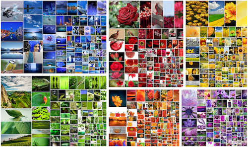
Treemap-based visualization for representing groups of photos with numeric attributes. Published at AVI 2016.
Elections & Civic Data

Colombian Presidential Election 2026 — First Round Results
Live visualizations of Colombia's 2026 presidential first round, scraping and aggregating municipality-level results from the Registraduría. A Curvas view plots every municipality by its winner and vote share, and a Mapas view shows each candidate's regional strength. Built with Observable Framework, D3, and TopoJSON.

US Presidential Election Results 2000–2024
Scrollytelling visualization of the 2024 US presidential election results, with historical data going back to 2000.


Colombian Senate Explorer
Interactive exploration of the Colombian Senate using Navio, allowing filtering and comparison of senators by party, region, and voting patterns.

Colombian Presidential Elections 2018
Scrollytelling visualizations of the Colombian presidential election results. First round, second round analysis.
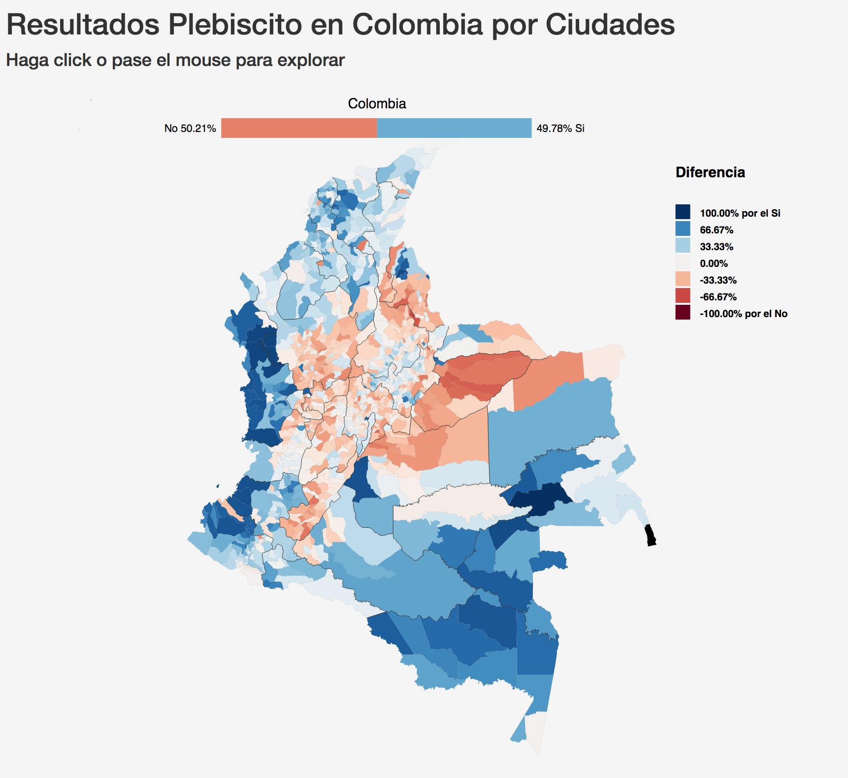
Colombian Peace Agreement Results
Map visualization of the 2016 Colombian peace agreement referendum results by municipality.

Anti-corruption Referendum 2018
Scrollytelling visualization of the Colombian anti-corruption referendum results.

Tweetometro
Real-time Twitter monitor and analyzer used during the Colombian presidential elections.
Open Source Libraries & Tools

force-in-a-box
D3 force layout extension for grouping nodes into clusters. 78 stars, 221 weekly downloads on npm.

d3-force-boundary
D3 force simulation plugin to keep nodes within boundaries. 1,400+ weekly downloads on npm.

netClustering.js
Network clustering library for JavaScript. Available on npm.

revealVizScroll
Scrollytelling plugin for Reveal.js presentations that synchronizes visualizations with slide transitions.
See live npm download stats for all packages →
AI & Developer Education

Paper Explorers
Interactive tools for exploring academic papers using sentence embeddings and dimensionality reduction. Semantic search across hundreds to thousands of papers.
CHI 2026, IEEE VIS 2025, CHI 2025, NeurIPS 2024, CSCW 2024, UIST 2024, IEEE VIS 2024, CHI 2024

UMAP Playground
Interactive web tool for testing the UMAP dimensionality reduction algorithm on your own data. Runs entirely in the browser.

Vibe Coding — AI-Assisted Software Engineering
Graduate course at Northeastern University teaching developers to build software with Claude Code, prompt engineering, agent architectures, MCP, and evaluation strategies.
Accessibility
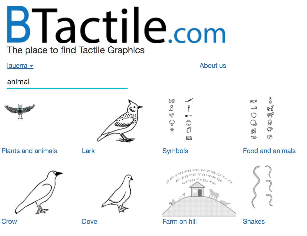
BTactile
Search engine indexing 5000+ tactile graphics for the blind from around the world. Built with React and Meteor.js.
Academic contributions
Patents and Software
- 2012 Main author Colombian Software Registration 13-34-484 "IRIS version 1.0", registered on October 9th 2012.
- 2011 Main author Colombian Software Registration 13-28-205 "IRIS version 3.0", registered on March 2nd 2011.
- 2007 USA Patent application number 20080174566. System for the perception of images through touch. Registered in April 2006 (Abandoned).
- 2006 International patent registration PCT/IB2006/001502 System for the perception of images with touch. In process with the WIPO (World Intellectual Property Organization) since June 2006.
- 2006 Colombian "IRIS" Trademark registration, class 9 valid from December 22nd 2008 through 2018.
- 2005 Colombian Patent No. 05-037765 "Sistema para la percepción de imágenes por medio del tacto por medio de un guante de imanes" (System for the perception of images by means of touch using a glove of magnets). Resolution 18963 of April 5 2011. Authors: María Fernanda Zúñiga Zabala, John Alexis Guerra Gómez and Felipe Restrepo Calle
Students
Classes
-
Northeastern University Oakland, CS3200: Database Management Systems 16 Weeks.
-
Northeastern University Oakland, CS 5500: Fundamentals of Software Engineering Paradigms 16 Weeks.
-
Northeastern University Oakland, CS 5010: Program Design Paradigms 16 Weeks.
-
Northeastern University Oakland, CS3200: Database Management Systems. Slides 16 Weeks.
-
Northeastern University Oakland, CS 5010: Program Design Paradigms 16 Weeks.
-
Northeastern University Oakland, CS3200: Database Management Systems 16 Weeks.
-
Northeastern University Bay Area, CS5200: Database Management Systems 16 Weeks.
-
Northeastern University Bay Area, CS 5340 Human Computer Interaction, Fall 2021 16 Weeks.
-
Northeastern University Bay Area, CS 5010 Program Design Paradigms, Spring 2022 16 Weeks.
-
Northeastern University Bay Area, CS 5200 Database Management Systems, Fall 2021 16 Weeks.
-
Northeastern University Bay Area, CS 5200 Database Management Systems, Summer 2021 16 Weeks.
-
Universidad de los Andes, ISIS 4822 : Visual Analytics 16 Weeks, in cooperation with Jose Tiberio Hernández
Talks and slides
- The quest for Insights, Singularity Summit Colombia Nov. 2018 (Video)
- What is IMAGINE doing on Visual Analytics?, IMAGINE'S 20 years Anniversary Seminar Nov 2018
- Visual analytics perspectives IMAGINE Workshop Summer 2018
- Untangling the hairball Openvisconf 2017
- Analyzing Growth Data in Pre-term Babies VIS2017 Healthcare workshop
- Time based visualizations, Hospital Militar 2017
- Good practices for visual analytics teaching
- Tips for Fulbrighters
- IMAGINE Research agenda
- Research agenda uniandes Summer 2017
- From data to insights: How open data can empower society Condatos2016 talk
- Network Visualization in the real world, lessons learned. IEEEVIS 2016 Talk (Visualization in Practice Workshop)
- The quest for the insights, the true objective of big data
- Network Explorer: Design, Implementation, and Real World Deployment of a Large Network Visualization Tool. AVI2016 presentation
- Identifying Best Practices for Visualizing Photo Statistics and Galleries Using Treemaps. AVI2016 presentation
- La minimentalidad. TEDxPereira, Ruta de la Ciencia 2016.